


SCROLL

project
жЎҲдҫӢеҲҶдә«
Client
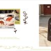
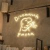
Dinomunch PastaпҪңеӨ§еҸЈеҗғжҺүз…©жғұпјҢе’Җеҡје°Ҹе°Ҹзўәе№ё
Design Scope
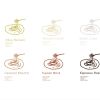
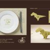
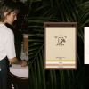
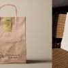
е“ҒзүҢиӯҳеҲҘзі»зөұиЁӯиЁҲгҖҒе“ҒзүҢиӯҳеҲҘжҮүз”ЁиЁӯиЁҲгҖҒй–ҖеёӮеҪўиұЎиЁӯиЁҲ
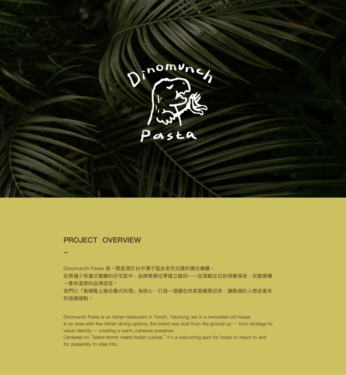
PROJECT OVERVIEW
-
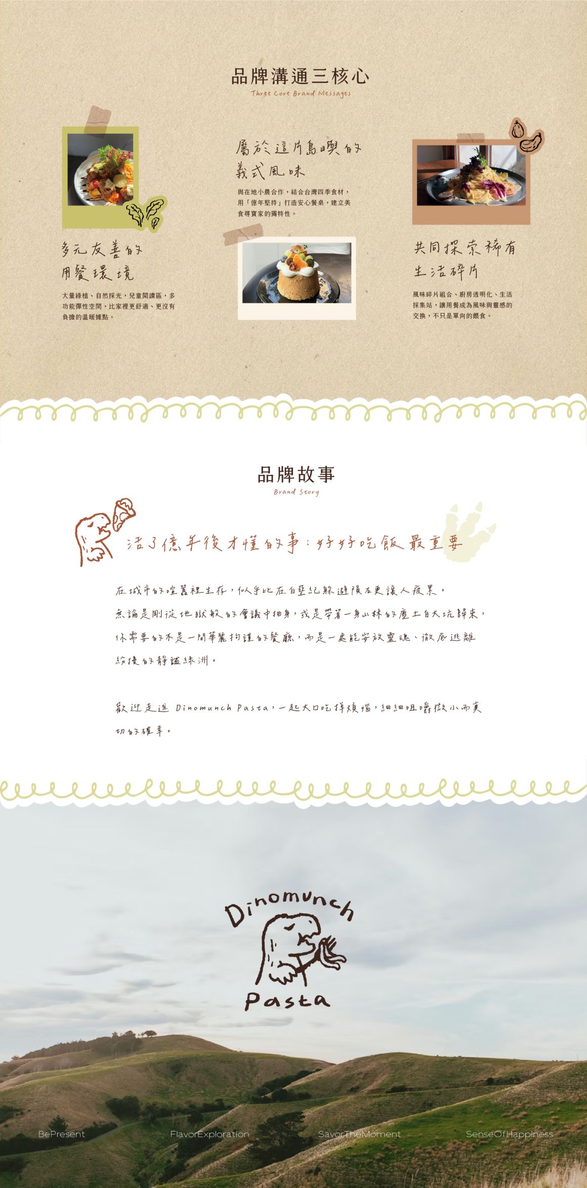
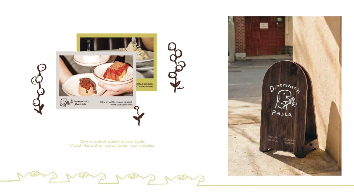
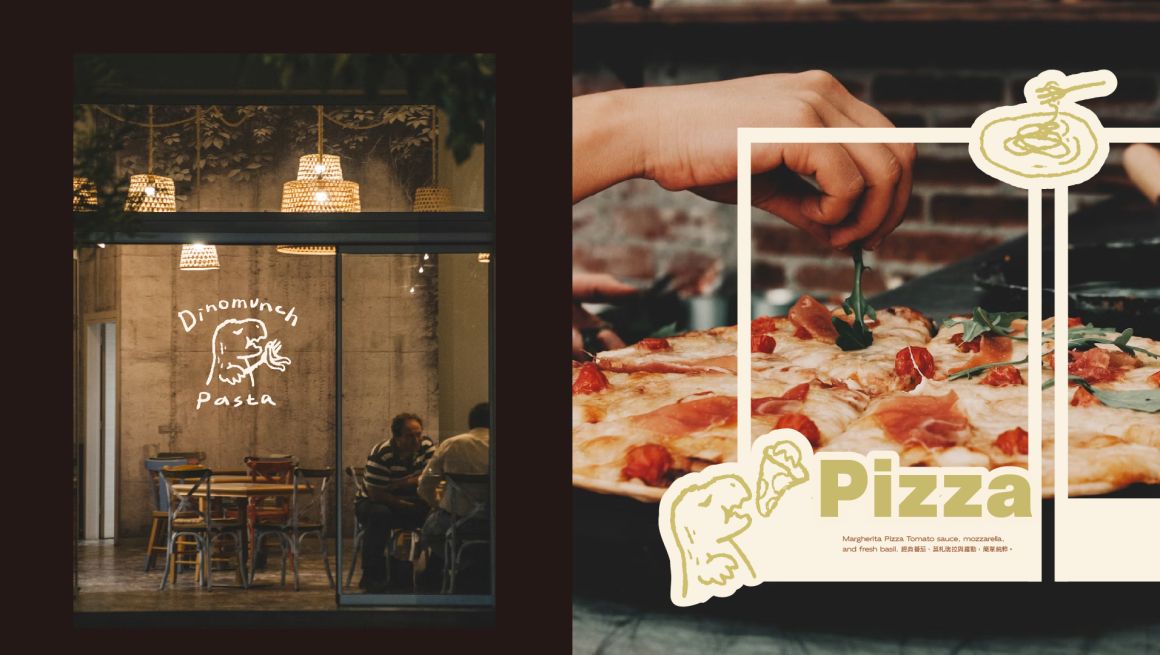
Dinomunch Pasta жҳҜдёҖй–“еә§иҗҪж–јеҸ°дёӯжҪӯеӯҗеҚҖз”ұиҖҒе®…ж”№е»әзҡ„зҫ©ејҸйӨҗе»ігҖӮ
еңЁе‘ЁйӮҠе°‘жңүзҫ©ејҸйӨҗе»ізҡ„дҪҸе®…еҚҖдёӯпјҢе“ҒзүҢйңҖиҰҒеҫһйӣ¶е»әз«ӢиӯҳеҲҘ——еҫһзӯ–з•Ҙе®ҡдҪҚеҲ°иҰ–иҰәиҗҪең°пјҢе®Ңж•ҙе»әж§ӢдёҖеҘ—жңүжә«еәҰзҡ„е“ҒзүҢиӘһиЁҖгҖӮ
жҲ‘еҖ‘д»ҘгҖҢеі¶е¶јйўЁеңҹиһҚеҗҲзҫ©ејҸж–ҷзҗҶгҖҚзӮәж ёеҝғпјҢжү“йҖ дёҖеҖӢи®“еңЁең°е®¶еәӯйЎҳж„ҸеӣһдҫҶгҖҒи®“и·ҜйҒҺзҡ„дәәжғіиө°йҖІдҫҶзҡ„жә«жҡ–ж“ҡй»һгҖӮ
Dinomunch Pasta is an Italian restaurant in Tanzih, Taichung, set in a renovated old house.
In an area with few Italian dining options, the brand was built from the ground up — from strategy to visual identity — creating a warm, cohesive presence.
Centered on “island terroir meets Italian cuisine,” it’s a welcoming spot for locals to return to and for passersby to step into.
DESIGN CONCEPT
-
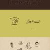
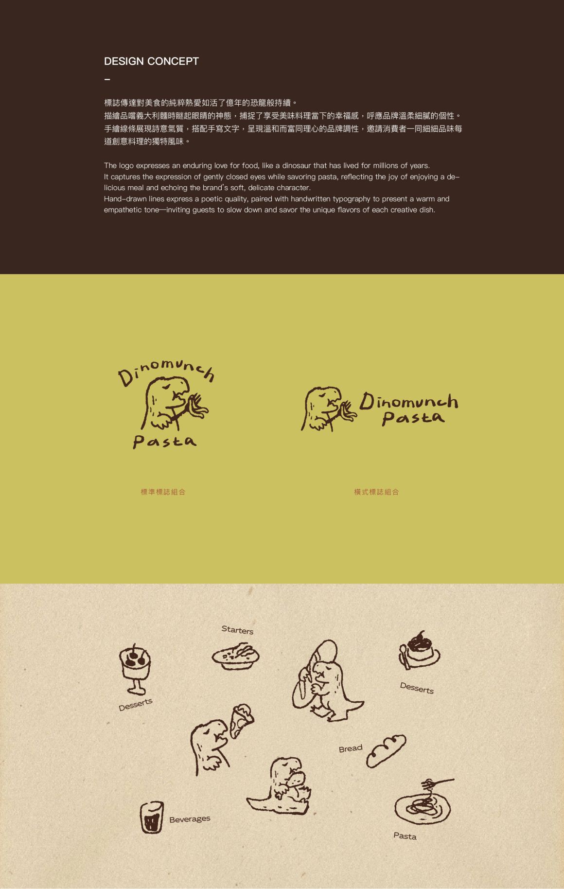
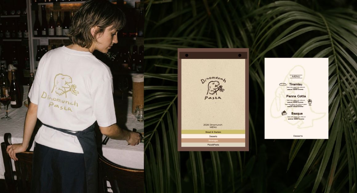
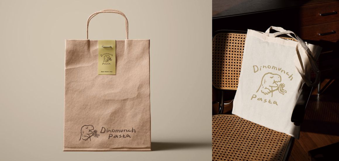
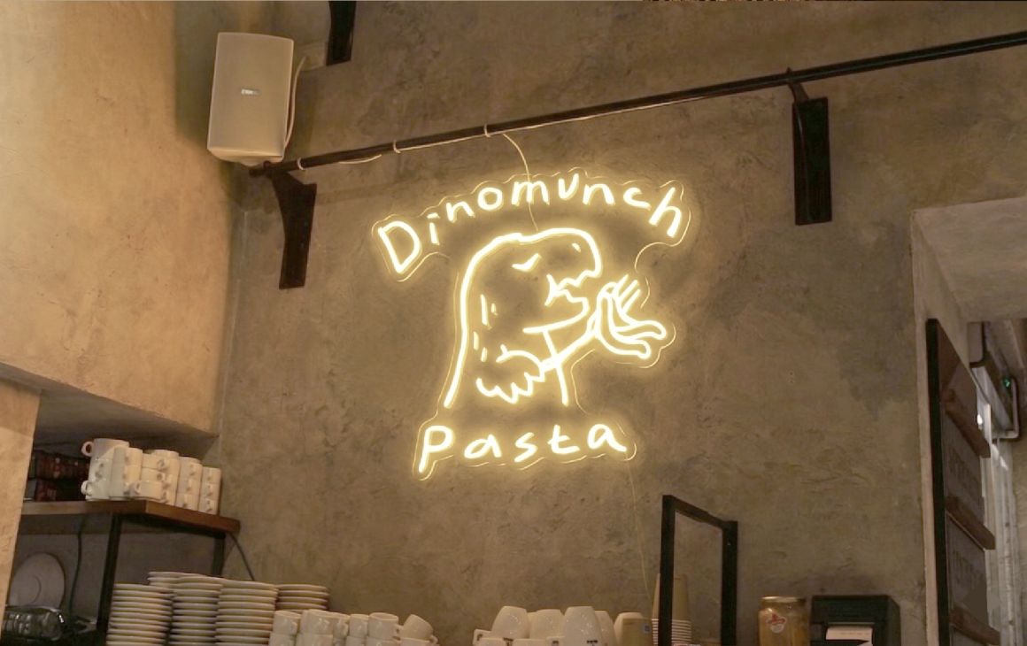
жЁҷиӘҢеӮійҒ”е°ҚзҫҺйЈҹзҡ„зҙ”зІ№зҶұж„ӣеҰӮжҙ»дәҶе„„е№ҙзҡ„жҒҗйҫҚиҲ¬жҢҒзәҢгҖӮ
жҸҸз№Әе“Ғеҡҗзҫ©еӨ§еҲ©йәөжҷӮзһҮиө·зңјзқӣзҡ„зҘһж…ӢпјҢжҚ•жҚүдәҶдә«еҸ—зҫҺе‘іж–ҷзҗҶ當дёӢзҡ„е№ёзҰҸж„ҹпјҢе‘јжҮүе“ҒзүҢжә«жҹ”зҙ°иҶ©зҡ„еҖӢжҖ§гҖӮжүӢз№Әз·ҡжўқеұ•зҸҫи©©ж„Ҹж°ЈиіӘпјҢжҗӯй…ҚжүӢеҜ«ж–Үеӯ—пјҢе‘ҲзҸҫжә«е’ҢиҖҢеҜҢеҗҢзҗҶеҝғзҡ„е“ҒзүҢиӘҝжҖ§пјҢйӮҖи«Ӣж¶ҲиІ»иҖ…дёҖеҗҢзҙ°зҙ°е“Ғе‘іжҜҸйҒ“еүөж„Ҹж–ҷзҗҶзҡ„зҚЁзү№йўЁе‘ігҖӮ
The logo expresses an enduring love for food, like a dinosaur that has lived for millions of years.
It captures the expression of gently closed eyes while savoring pasta, reflecting the joy of enjoying a delicious meal and echoing the brand’s soft, delicate character.
Hand-drawn lines express a poetic quality, paired with handwritten typography to present a warm and empathetic tone—inviting guests to slow down and savor the unique flavors of each creative dish.
-
Dinomunch Pasta жҳҜдёҖй–“еә§иҗҪж–јеҸ°дёӯжҪӯеӯҗеҚҖз”ұиҖҒе®…ж”№е»әзҡ„зҫ©ејҸйӨҗе»ігҖӮ
еңЁе‘ЁйӮҠе°‘жңүзҫ©ејҸйӨҗе»ізҡ„дҪҸе®…еҚҖдёӯпјҢе“ҒзүҢйңҖиҰҒеҫһйӣ¶е»әз«ӢиӯҳеҲҘ——еҫһзӯ–з•Ҙе®ҡдҪҚеҲ°иҰ–иҰәиҗҪең°пјҢе®Ңж•ҙе»әж§ӢдёҖеҘ—жңүжә«еәҰзҡ„е“ҒзүҢиӘһиЁҖгҖӮ
жҲ‘еҖ‘д»ҘгҖҢеі¶е¶јйўЁеңҹиһҚеҗҲзҫ©ејҸж–ҷзҗҶгҖҚзӮәж ёеҝғпјҢжү“йҖ дёҖеҖӢи®“еңЁең°е®¶еәӯйЎҳж„ҸеӣһдҫҶгҖҒи®“и·ҜйҒҺзҡ„дәәжғіиө°йҖІдҫҶзҡ„жә«жҡ–ж“ҡй»һгҖӮ
Dinomunch Pasta is an Italian restaurant in Tanzih, Taichung, set in a renovated old house.
In an area with few Italian dining options, the brand was built from the ground up — from strategy to visual identity — creating a warm, cohesive presence.
Centered on “island terroir meets Italian cuisine,” it’s a welcoming spot for locals to return to and for passersby to step into.
DESIGN CONCEPT
-
жЁҷиӘҢеӮійҒ”е°ҚзҫҺйЈҹзҡ„зҙ”зІ№зҶұж„ӣеҰӮжҙ»дәҶе„„е№ҙзҡ„жҒҗйҫҚиҲ¬жҢҒзәҢгҖӮ
жҸҸз№Әе“Ғеҡҗзҫ©еӨ§еҲ©йәөжҷӮзһҮиө·зңјзқӣзҡ„зҘһж…ӢпјҢжҚ•жҚүдәҶдә«еҸ—зҫҺе‘іж–ҷзҗҶ當дёӢзҡ„е№ёзҰҸж„ҹпјҢе‘јжҮүе“ҒзүҢжә«жҹ”зҙ°иҶ©зҡ„еҖӢжҖ§гҖӮжүӢз№Әз·ҡжўқеұ•зҸҫи©©ж„Ҹж°ЈиіӘпјҢжҗӯй…ҚжүӢеҜ«ж–Үеӯ—пјҢе‘ҲзҸҫжә«е’ҢиҖҢеҜҢеҗҢзҗҶеҝғзҡ„е“ҒзүҢиӘҝжҖ§пјҢйӮҖи«Ӣж¶ҲиІ»иҖ…дёҖеҗҢзҙ°зҙ°е“Ғе‘іжҜҸйҒ“еүөж„Ҹж–ҷзҗҶзҡ„зҚЁзү№йўЁе‘ігҖӮ
The logo expresses an enduring love for food, like a dinosaur that has lived for millions of years.
It captures the expression of gently closed eyes while savoring pasta, reflecting the joy of enjoying a delicious meal and echoing the brand’s soft, delicate character.
Hand-drawn lines express a poetic quality, paired with handwritten typography to present a warm and empathetic tone—inviting guests to slow down and savor the unique flavors of each creative dish.