project
案例分享
Client
旅幸福集團 Hotel Initial|在你的時區遇見幸福
Design Scope
品牌建構、品牌定位、品牌設計、品牌策略、市場分析、CIS品牌識別設計、體驗設計
Project Overview
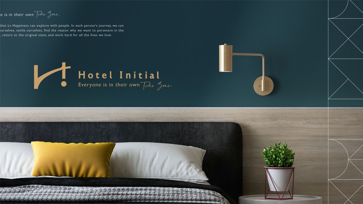
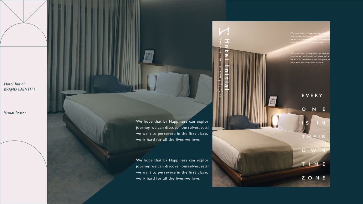
旅幸福為連鎖旅店集團,旗下多個品牌旅店呈現豐富多樣的風格旅店。秉持『在你的時區裡,遇見幸福』為核心理念,提供遇⾒不同事物的交流平臺與相遇之處為⽬標,結合老台中獨有的⽂化情懷與現代藝術的交匯。
品牌將”老台中獨有文化”、”飲食文化”、”獨立藝文活動”作為發展方向,藉著走出不同的城市,在⽂化與⼈們交織的故事裡,除了感受平凡⽽不易的幸福,我們更希望每位旅⼈能擁有過的幸福的能⼒。或許只是想轉換⼼情、只是想放鬆⼀下,不需要太多的理由,每個⼈都有⾃⼰的發展時區,時區裡都有屬於⾃⼰的步程;在名為幸福的旅途中成為熱愛中的自己,而在這趟旅程過後,能讓心靈恢復最初的寧靜,並填滿新的能量。
Design Concept
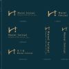
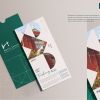
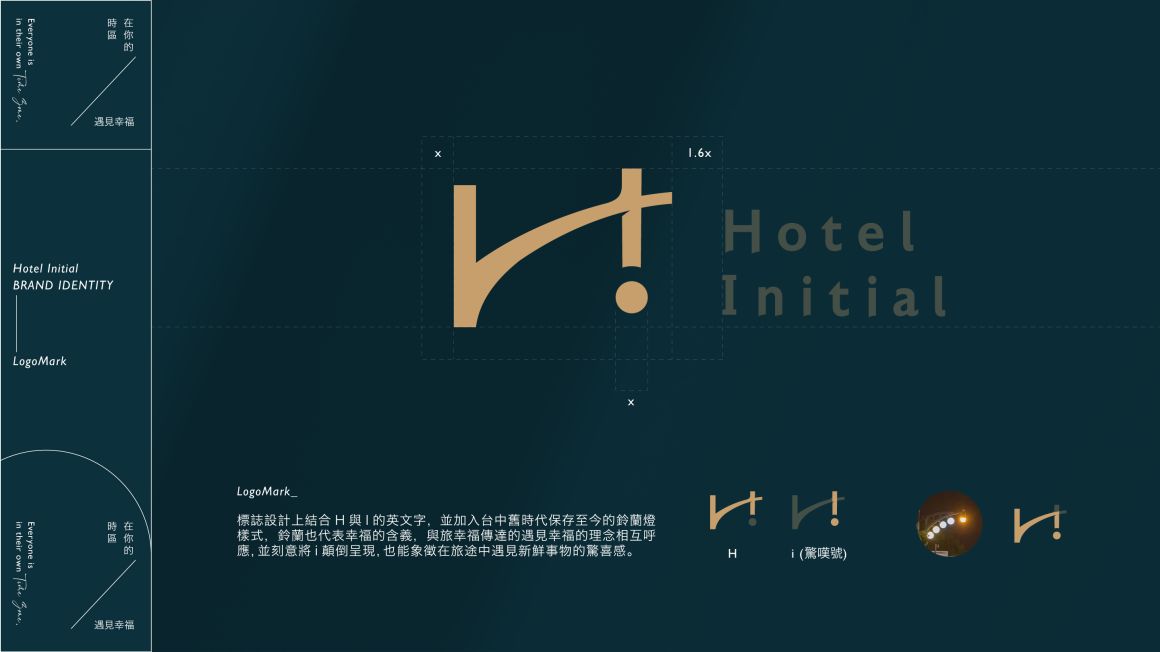
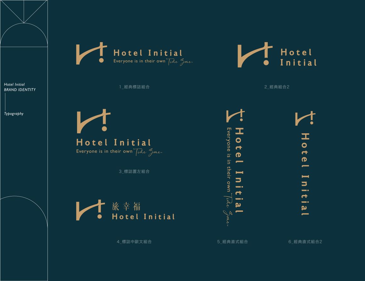
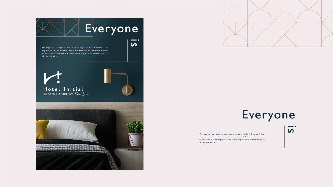
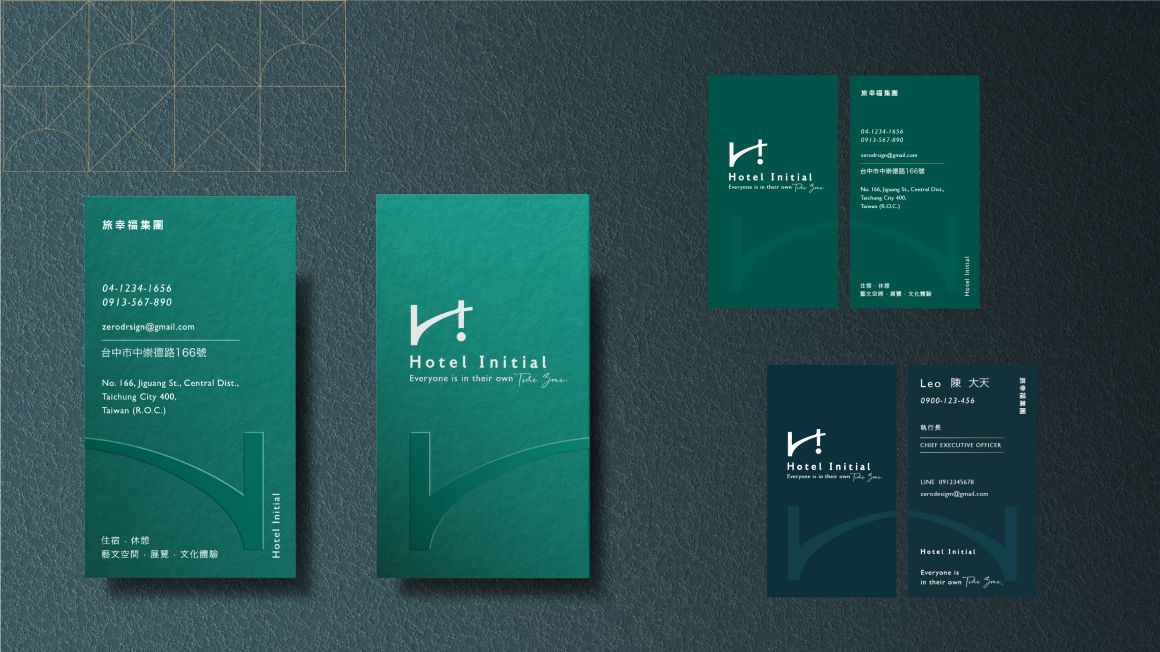
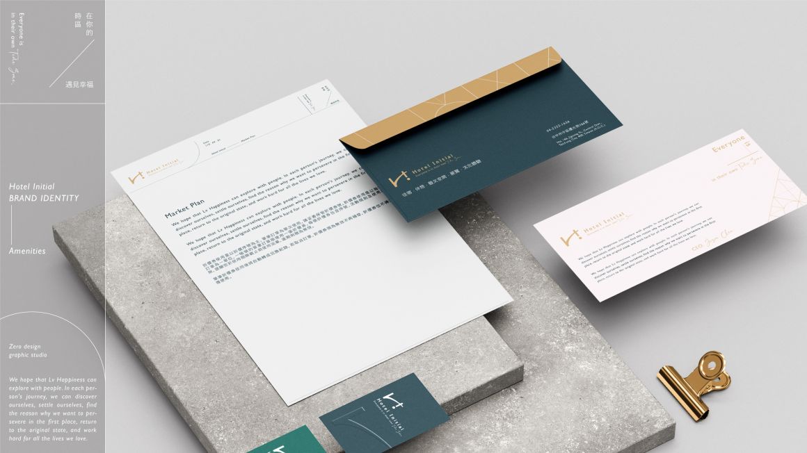
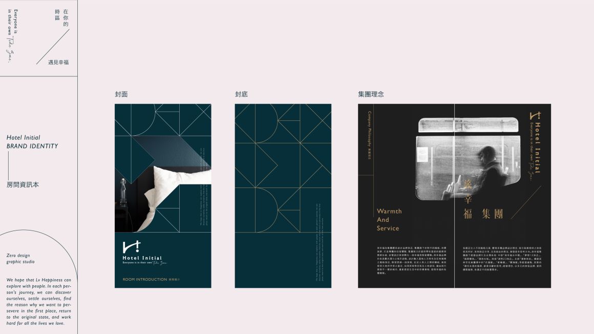
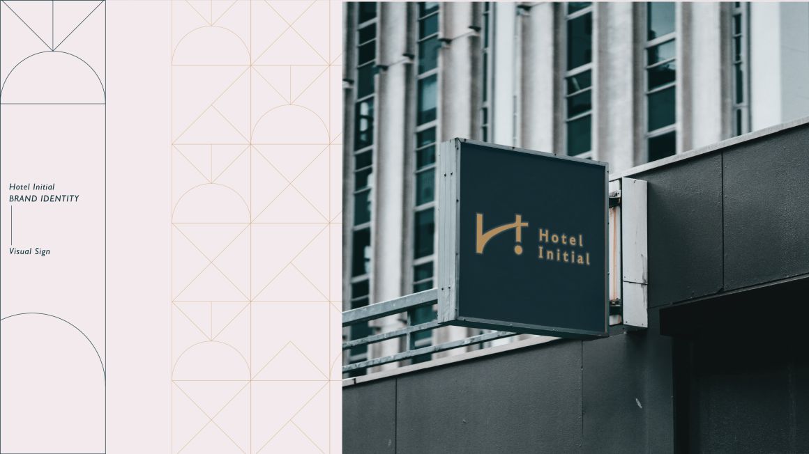
在標誌設計上結合品牌名中H與I的英文字,加入台中舊時代保存至今的鈴蘭燈樣式,鈴蘭也代表幸福的含意,與旅幸福傳達的『遇見幸福』理念相呼應,並刻意將i顛倒呈現,象徵在旅途中遇見新鮮事物的驚喜感。
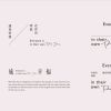
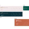
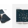
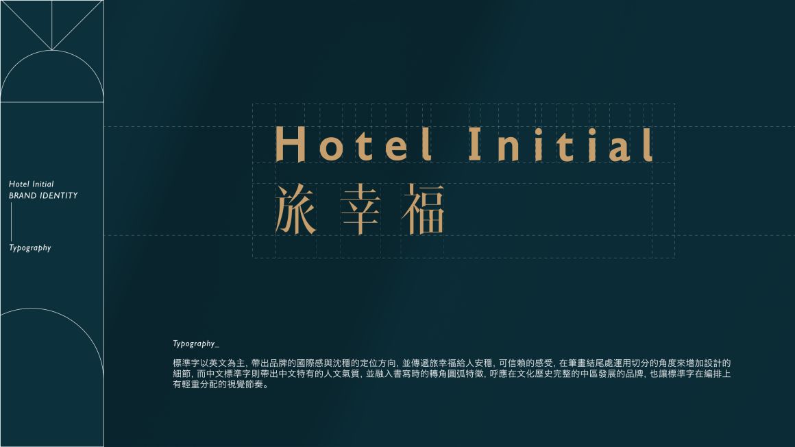
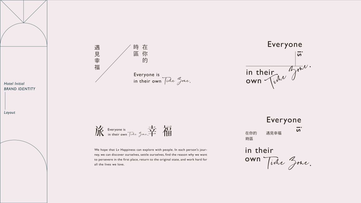
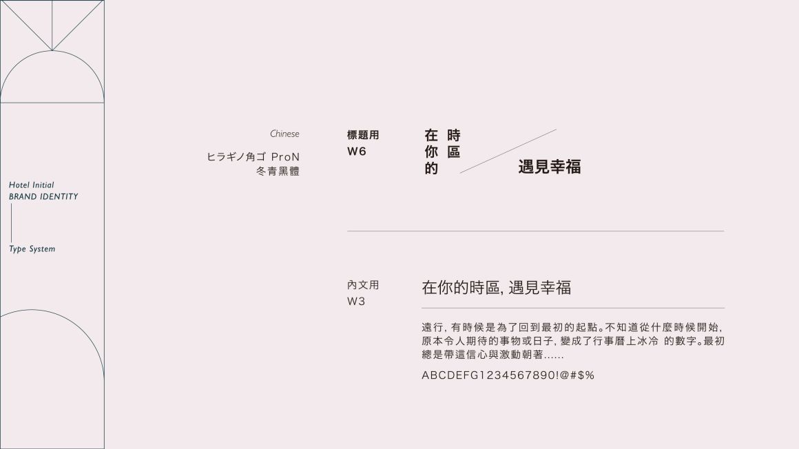
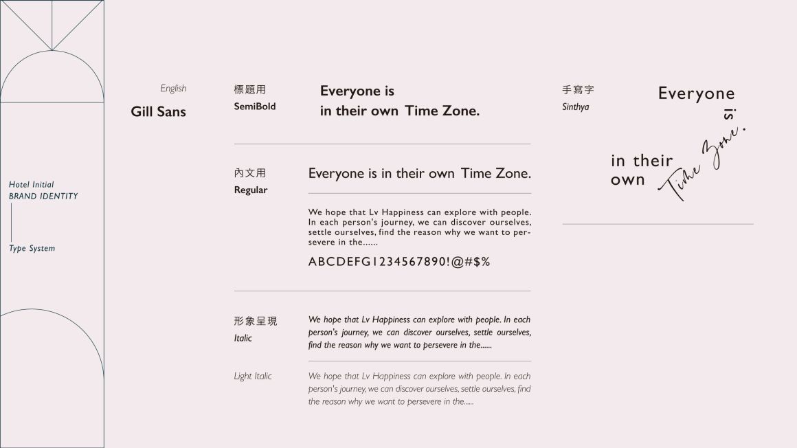
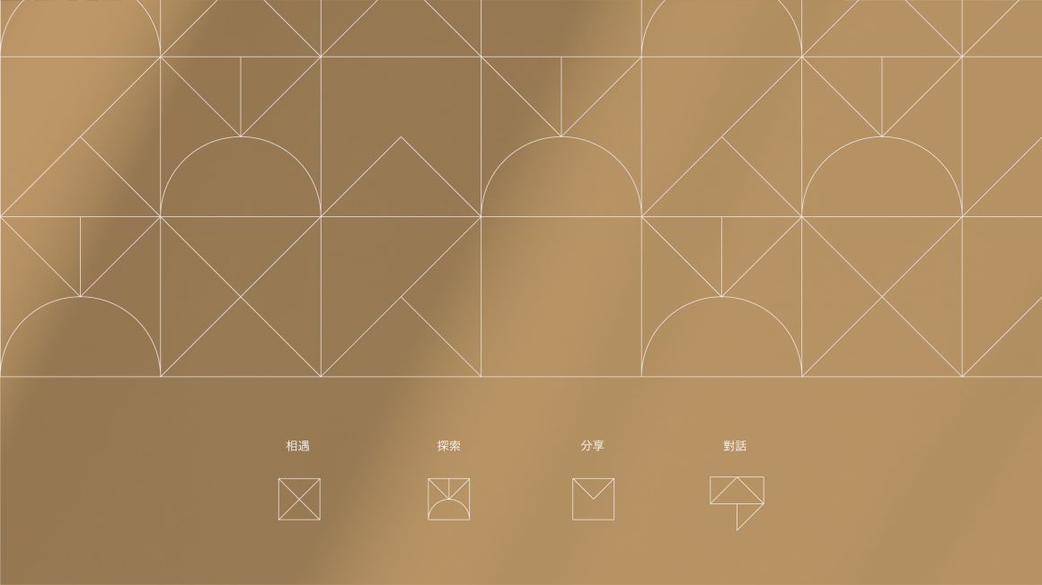
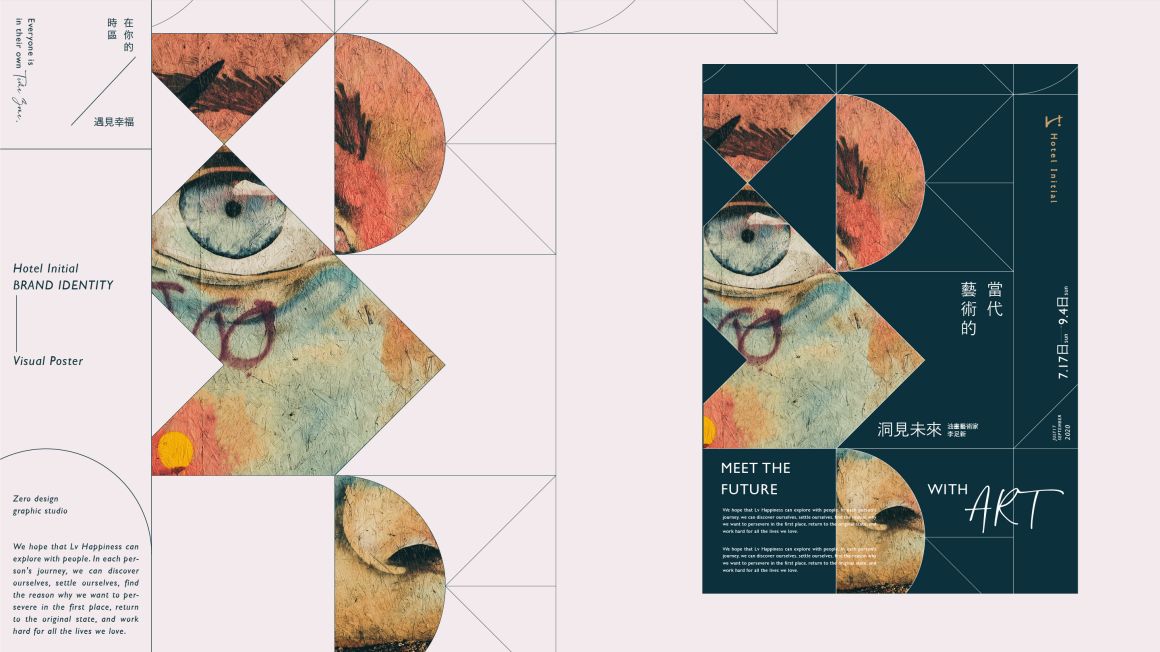
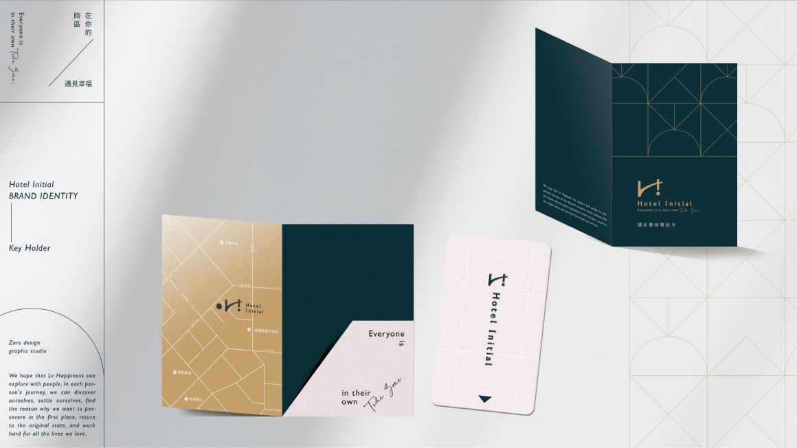
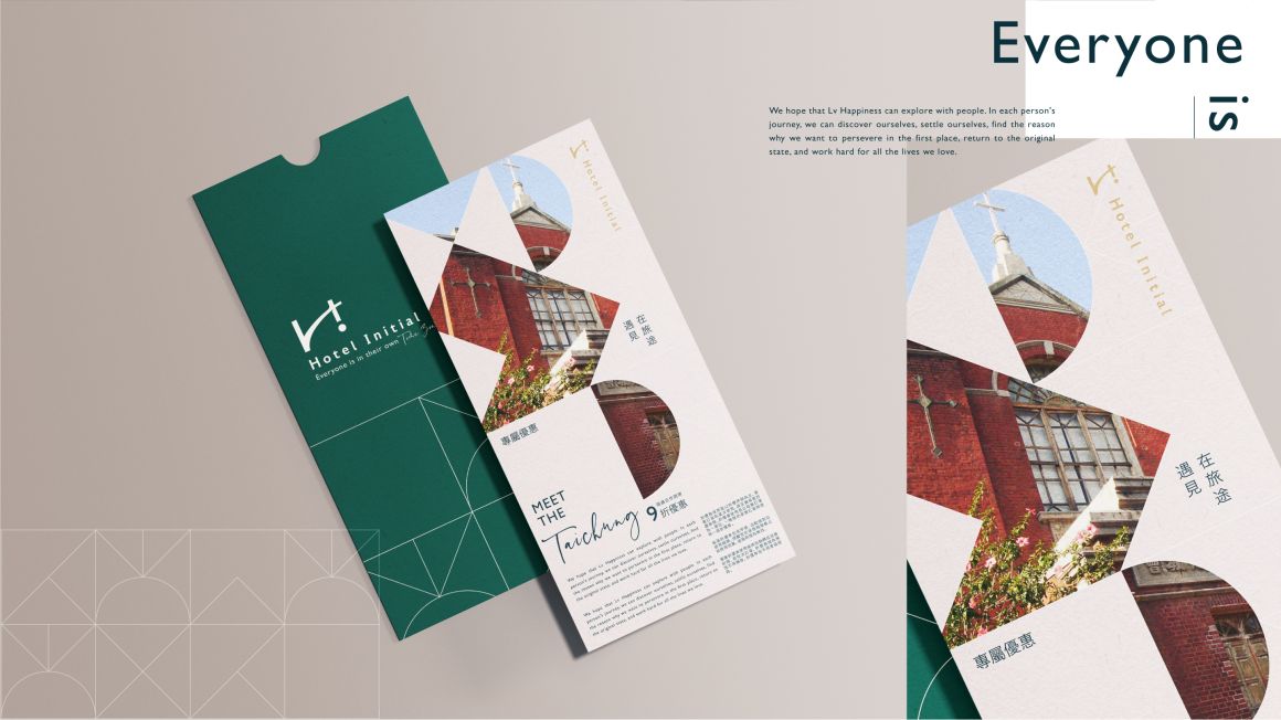
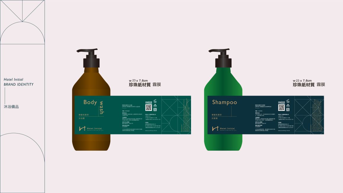
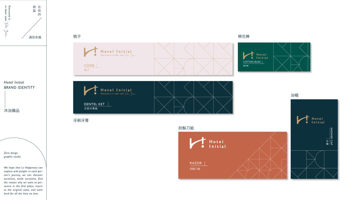
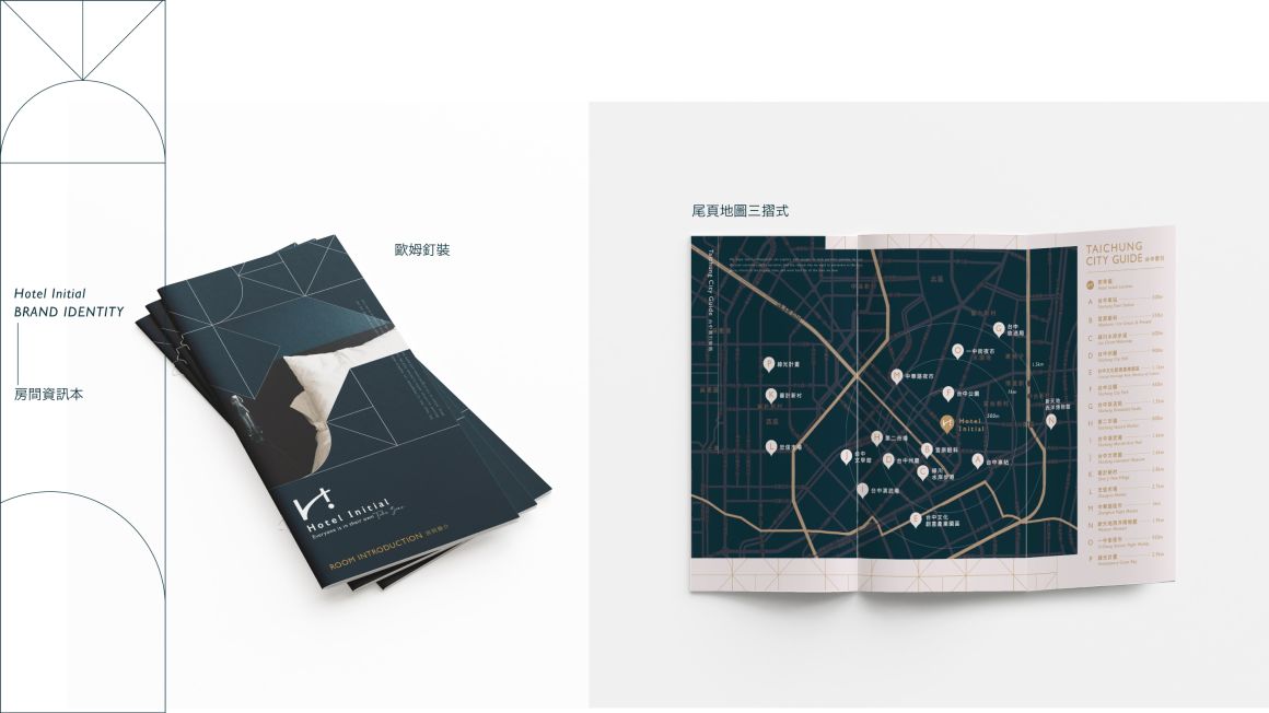
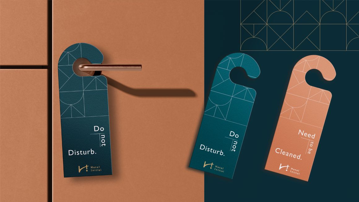
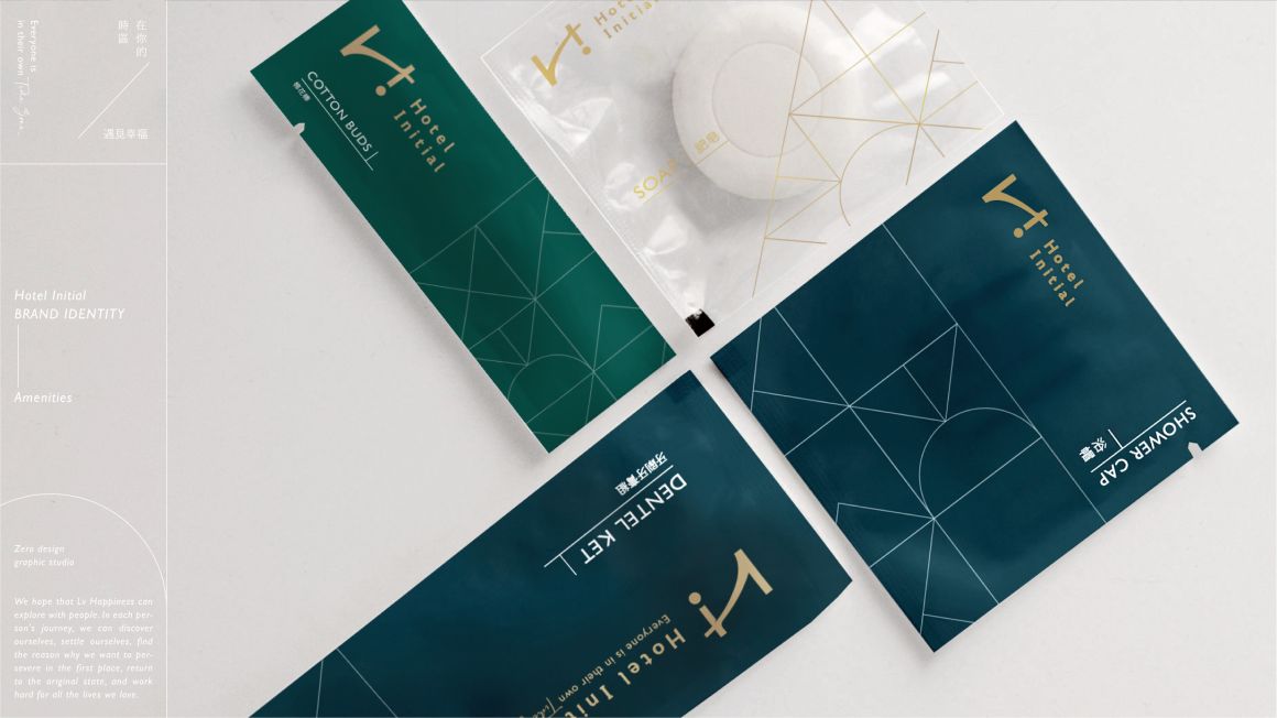
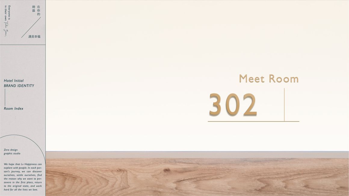
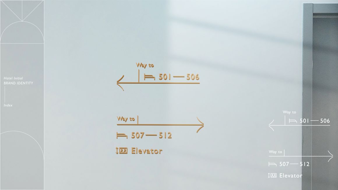
而英文的標準字中,帶出品牌國際感與沉穩的定位,傳遞品牌給人安穩、可信賴的感受;中文標準字則帶出人文氣質,呼應在文化歷史完整中發展的品牌;延伸的輔助圖形以相遇、探索、分享、對話為核心元素,運用幾何線條的交織豐富企業的視覺形象。
-
Project Overview
Hotel Initial is a chain hotel group that features a wide variety of hotel styles across its multiple brands. With the core philosophy of "Everyone is in their own TIME ZONE." our goal is to create a platform for diverse exchanges and encounters, blending the cultural heritage of Old Taichung with modern art.
The brand draws its inspiration from the unique culture of Old Taichung, its culinary traditions, and its independent arts scene. By expanding into different cities, we weave together stories of culture and people, inviting travelers to experience the simple yet profound feeling of happiness. We hope that each guest can leave not only with cherished memories but also with the ability to embrace happiness in their own lives. Whether you're seeking a change of pace or just a moment to relax, you don’t need many reasons—everyone has their own pace in their personal time zone. Along this journey toward happiness, you will find the opportunity to become your best self, restoring inner peace and recharging with new energy.
Design Concept
The logo design combines the English letters "H" and "I" from the brand name, integrating the image of the traditional "Lily of the Valley" streetlights from Old Taichung, which symbolize happiness. This resonates with Hotel Initial's message of "Encountering Happiness." The letter "i" is intentionally flipped, representing the sense of surprise and novelty that travelers discover along their journey.
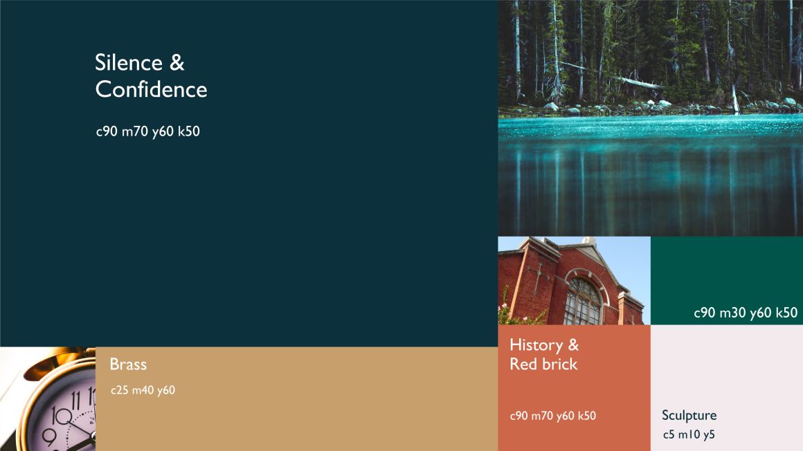
In the English logotype, the brand conveys an international and stable image, evoking feelings of trust and security. Meanwhile, the Chinese logotype emphasizes the brand’s cultural and humanistic qualities, reflecting its development in the context of rich historical heritage. The extended visual elements focus on the themes of encounter, exploration, sharing, and dialogue, using interwoven geometric lines to enrich the brand’s visual identity.


