





SCROLL













project
案例分享
Client
泰和源 Tai Ho Yuan|一口喚起記憶,一塊凝成心意
Design Scope
品牌設計、文案標語、品牌識別、企業識別、門市形象設計、應用物設計
Project Overview
-
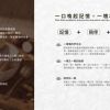
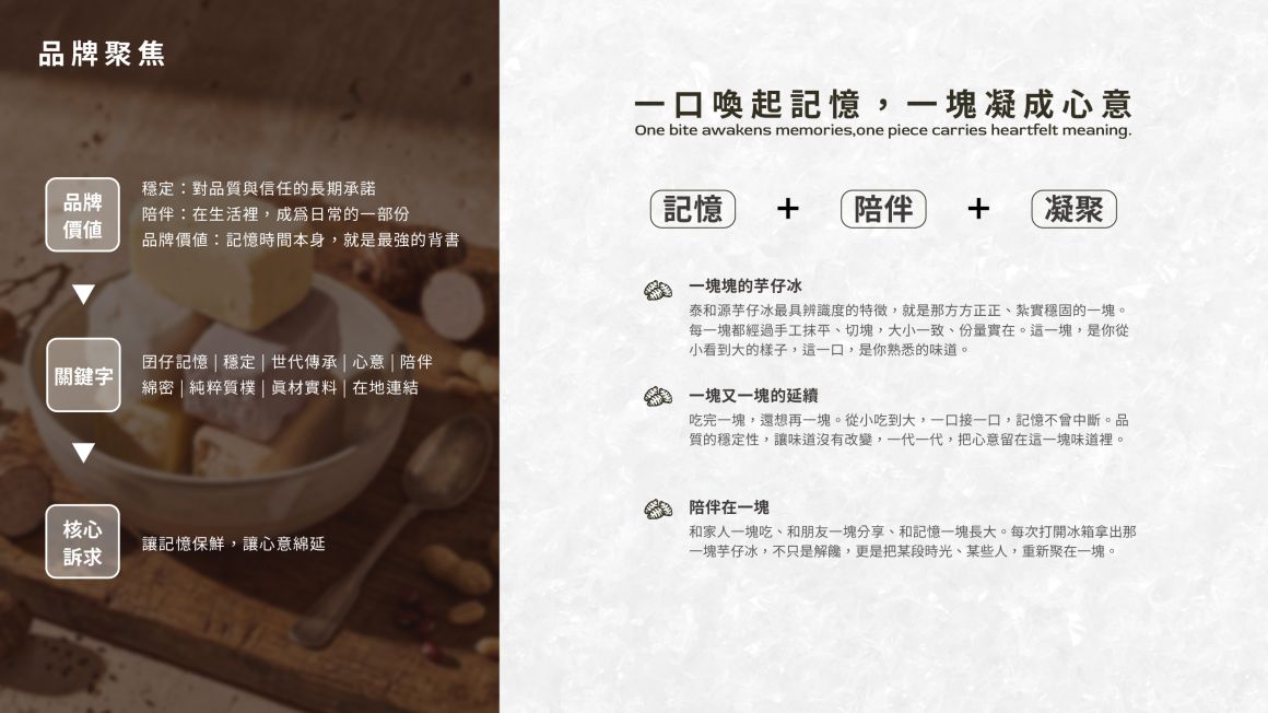
泰和源:一口喚起記憶,一塊凝成心意
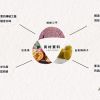
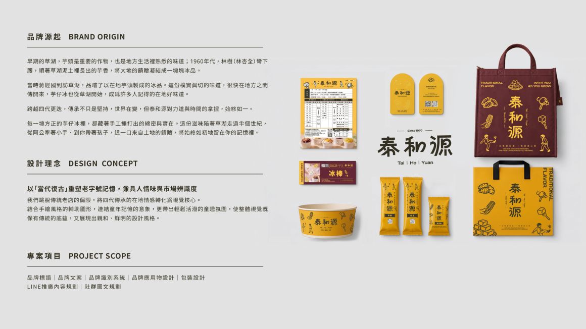
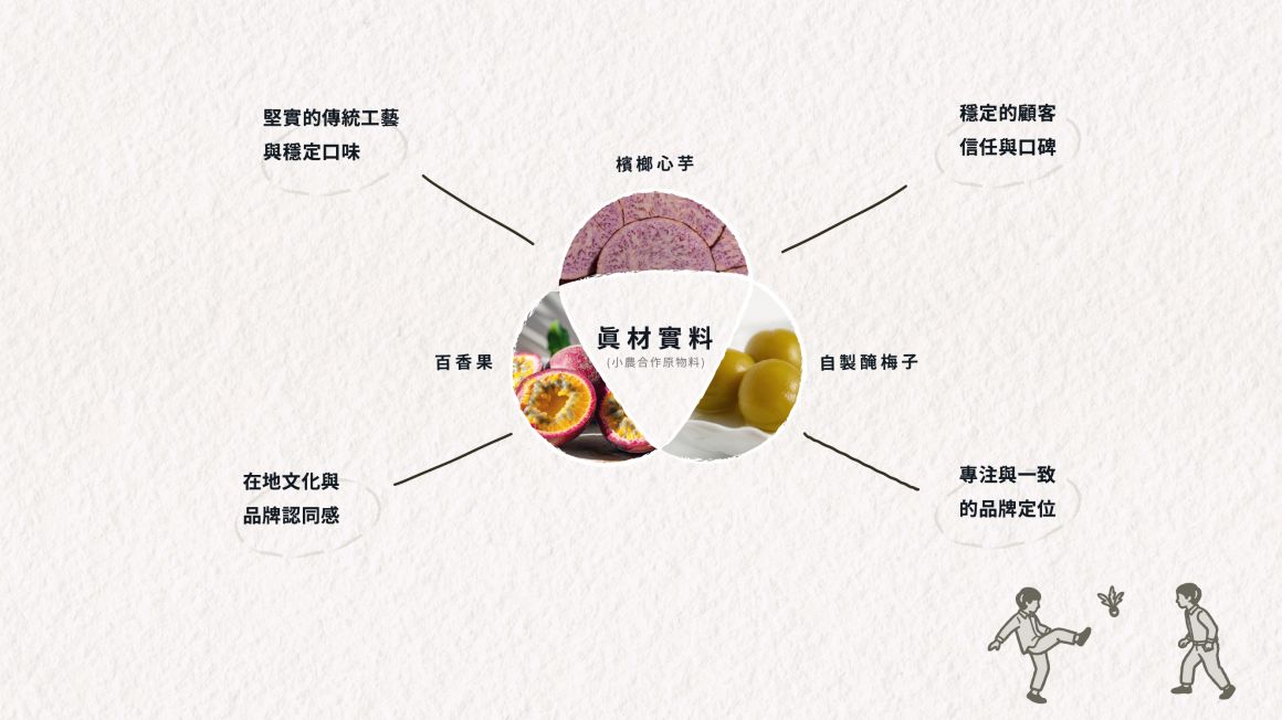
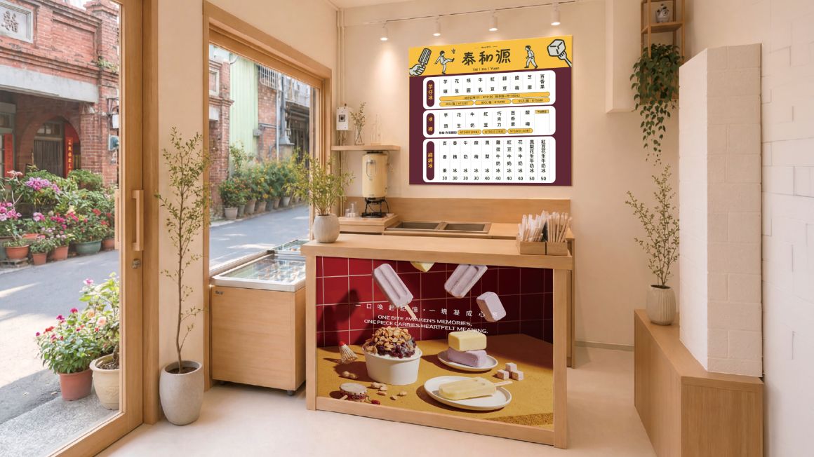
以「當代復古」重塑老字號記憶,兼具人情味與市場辨識度。
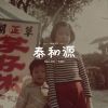
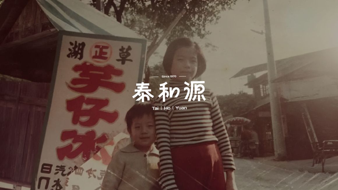
我們跳脫傳統老店的侷限,將四代傳承的在地情感轉化為視覺核心。
Tai He Yuan: A taste that evokes memories, a piece crafted with heart.
Reshaping the heritage brand's legacy through 'contemporary retro,' blending authentic warmth with market distinctiveness.
Moving beyond the limitations of traditional shops, we transform four generations of local sentiment into our visual core.
Design Concept
-
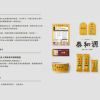
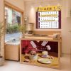
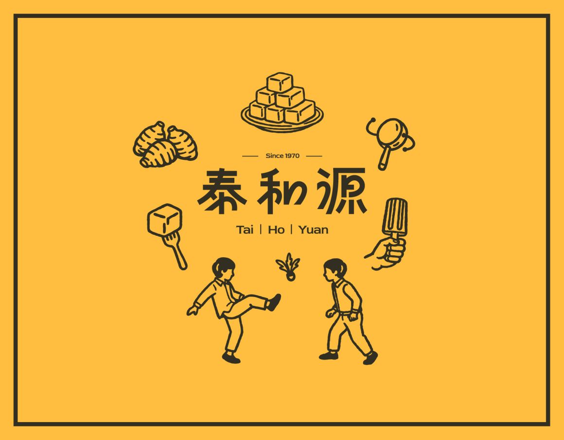
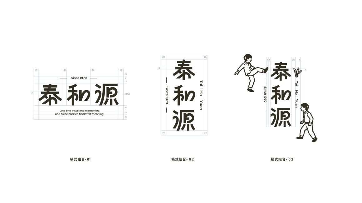
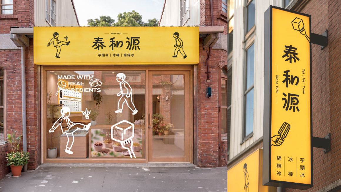
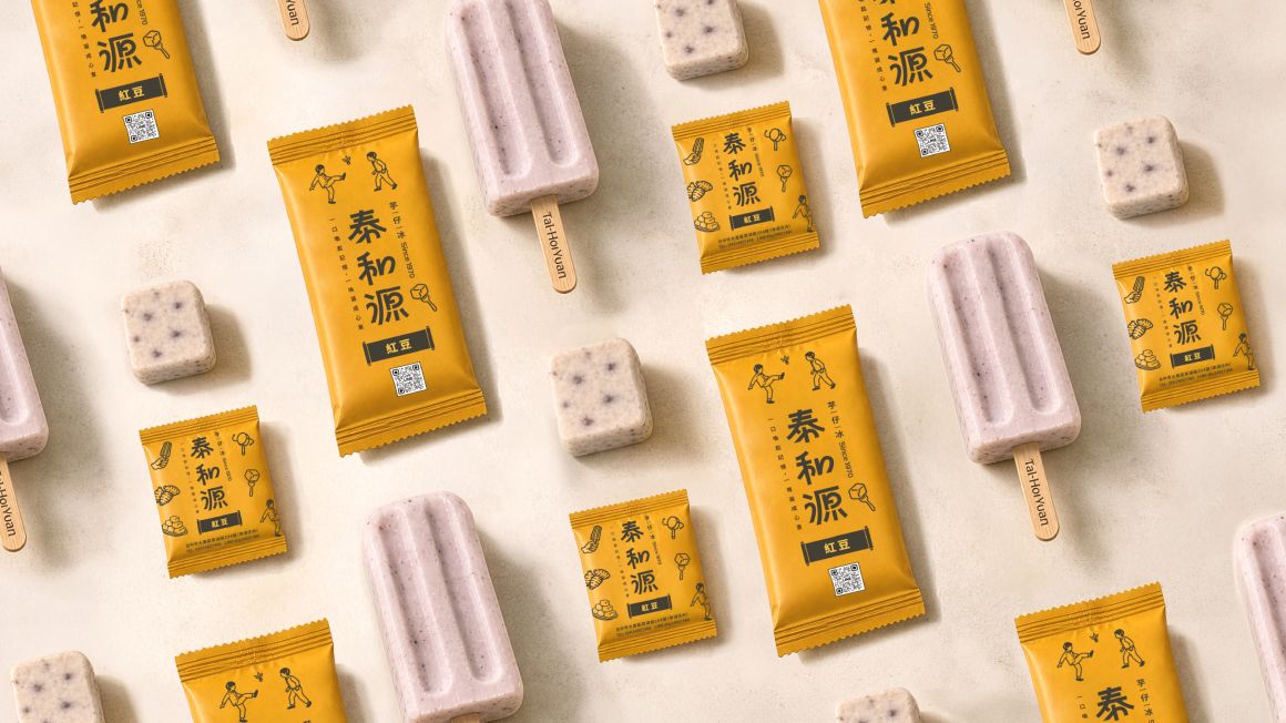
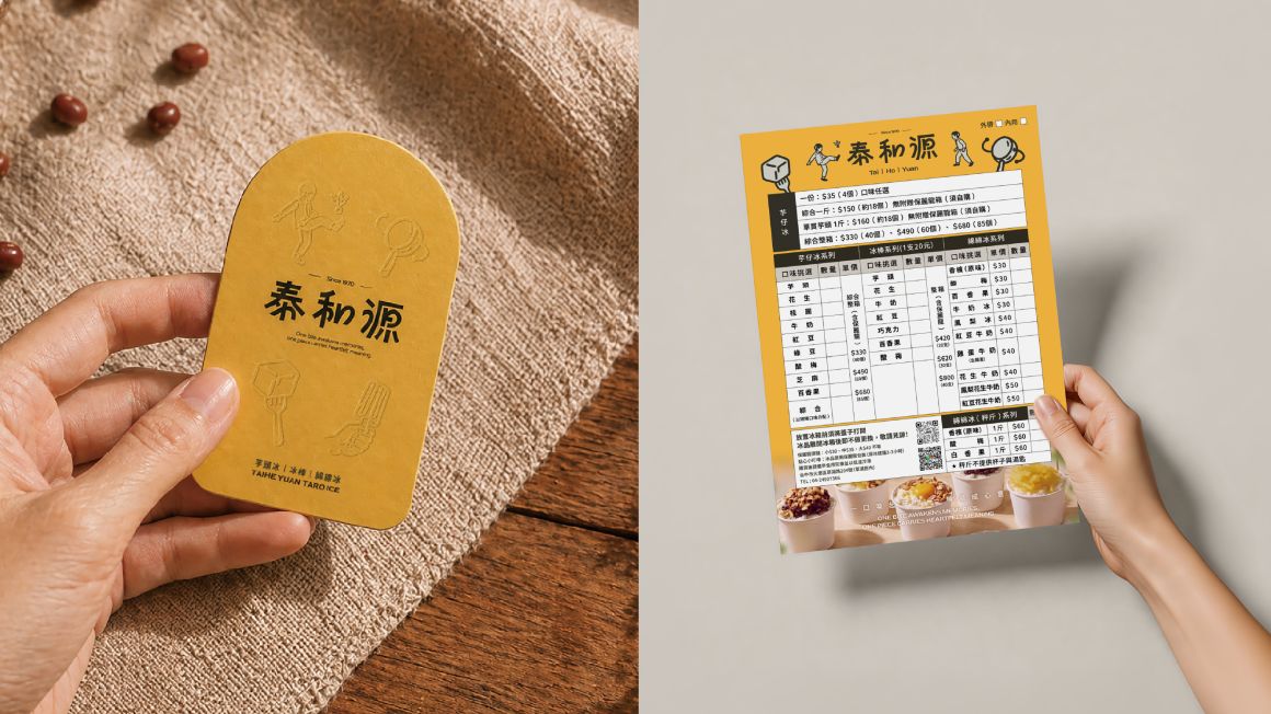
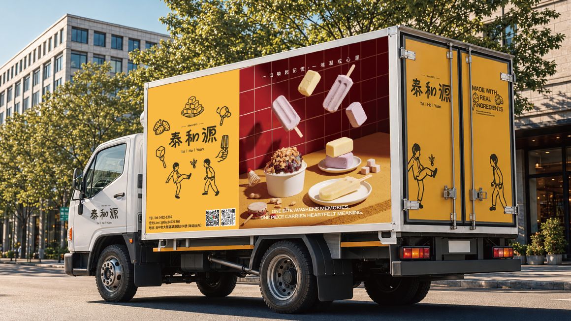
品牌標誌結合手繪風格的輔助圖形,連結童年記憶的意象,更帶出輕鬆活潑的童趣氛圍,使整體視覺既保有傳統的底藴,又展現出親和、鮮明的設計風格。
The brand logo combines hand-drawn auxiliary graphics to evoke childhood memories, bringing out a playful and lively atmosphere.
This creates a visual identity that preserves traditional heritage while showcasing an approachable and vibrant design style.
LogoType Concept
-
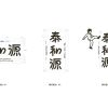
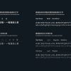
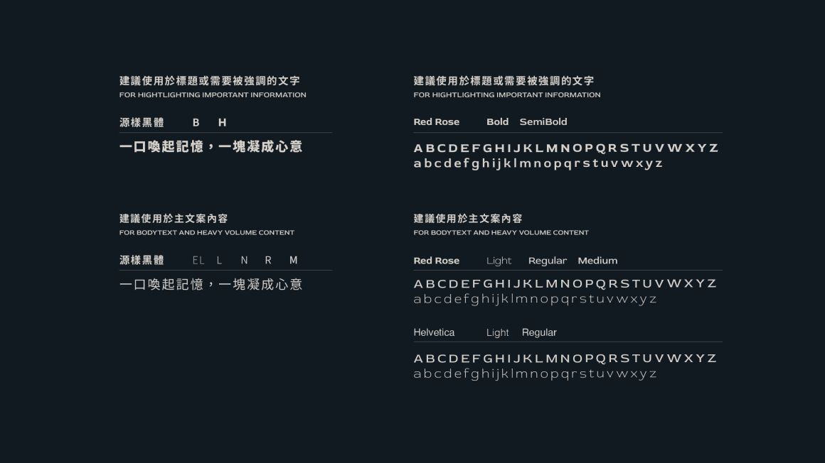
標準字以現代黑體為基礎進行筆畫節奏的重新配置, 建立具有動態感的字體,結構中保留些微圓潤變化, 帶出一種輕鬆且貼近日常的感受。
Built on a modern sans-serif foundation, the wordmark introduces a dynamic rhythm through refined stroke adjustments. Soft, rounded details bring a relaxed and approachable character to the overall design.
Logo Concept
-
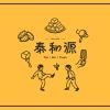
標誌結合兒時的童玩記憶,以踢毽子的互動場景作為核心畫面,象徵陪伴與分享的日常片刻,簡單卻深刻的情感連結,讓品牌傳達一段成長過程中的記憶。整體風格現代且具有人情味,讓品牌在第一眼就具備畫面感與吸引力,呈現出較為外向、鮮明的個性。
Inspired by childhood memories and the playful spirit of shuttlecock kicking, the logo captures moments of companionship, sharing, and growing up. A modern yet warm visual style gives the brand a distinctive and expressive personality.
-
泰和源:一口喚起記憶,一塊凝成心意
以「當代復古」重塑老字號記憶,兼具人情味與市場辨識度。
我們跳脫傳統老店的侷限,將四代傳承的在地情感轉化為視覺核心。
Tai He Yuan: A taste that evokes memories, a piece crafted with heart.
Reshaping the heritage brand's legacy through 'contemporary retro,' blending authentic warmth with market distinctiveness.
Moving beyond the limitations of traditional shops, we transform four generations of local sentiment into our visual core.
Design Concept
-
品牌標誌結合手繪風格的輔助圖形,連結童年記憶的意象,更帶出輕鬆活潑的童趣氛圍,使整體視覺既保有傳統的底藴,又展現出親和、鮮明的設計風格。
The brand logo combines hand-drawn auxiliary graphics to evoke childhood memories, bringing out a playful and lively atmosphere.
This creates a visual identity that preserves traditional heritage while showcasing an approachable and vibrant design style.
LogoType Concept
-
標準字以現代黑體為基礎進行筆畫節奏的重新配置, 建立具有動態感的字體,結構中保留些微圓潤變化, 帶出一種輕鬆且貼近日常的感受。
Built on a modern sans-serif foundation, the wordmark introduces a dynamic rhythm through refined stroke adjustments. Soft, rounded details bring a relaxed and approachable character to the overall design.
Logo Concept
-
標誌結合兒時的童玩記憶,以踢毽子的互動場景作為核心畫面,象徵陪伴與分享的日常片刻,簡單卻深刻的情感連結,讓品牌傳達一段成長過程中的記憶。整體風格現代且具有人情味,讓品牌在第一眼就具備畫面感與吸引力,呈現出較為外向、鮮明的個性。
Inspired by childhood memories and the playful spirit of shuttlecock kicking, the logo captures moments of companionship, sharing, and growing up. A modern yet warm visual style gives the brand a distinctive and expressive personality.