


SCROLL

project
案例分享
Client
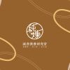
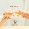
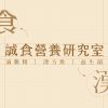
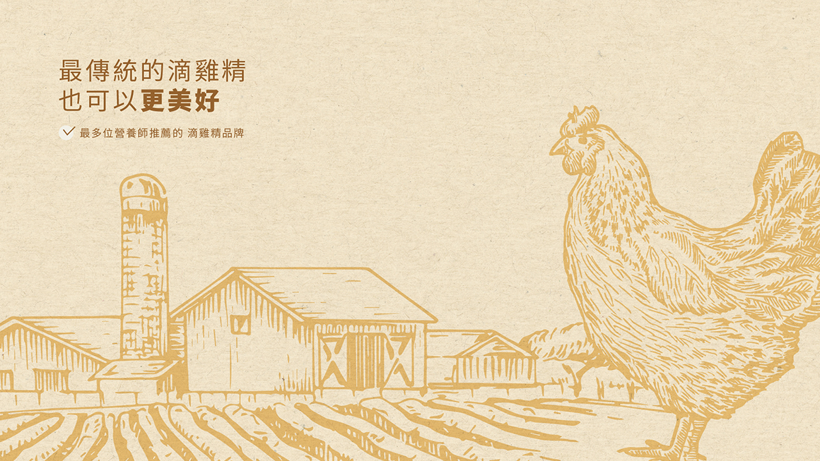
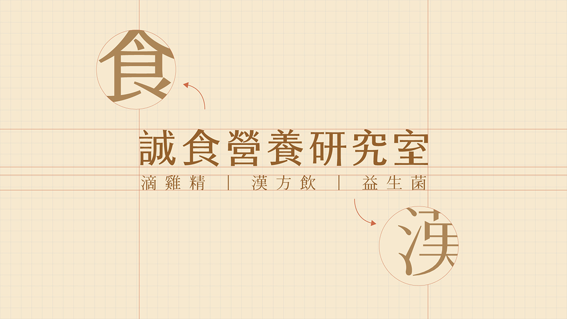
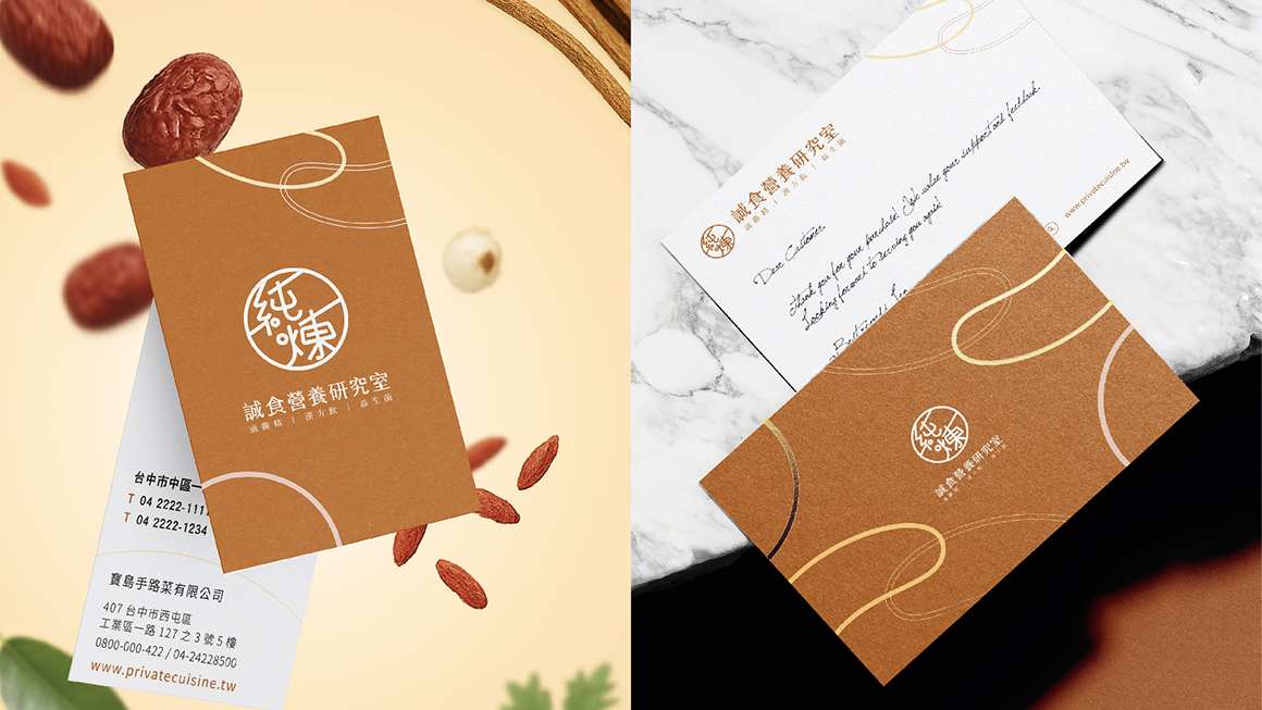
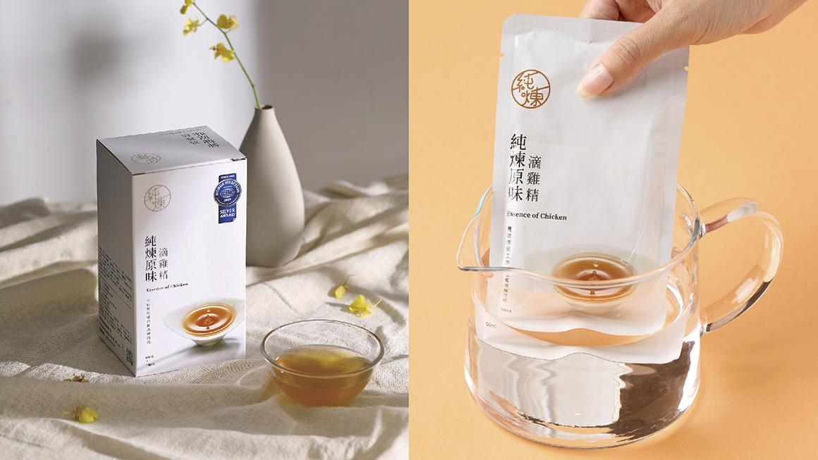
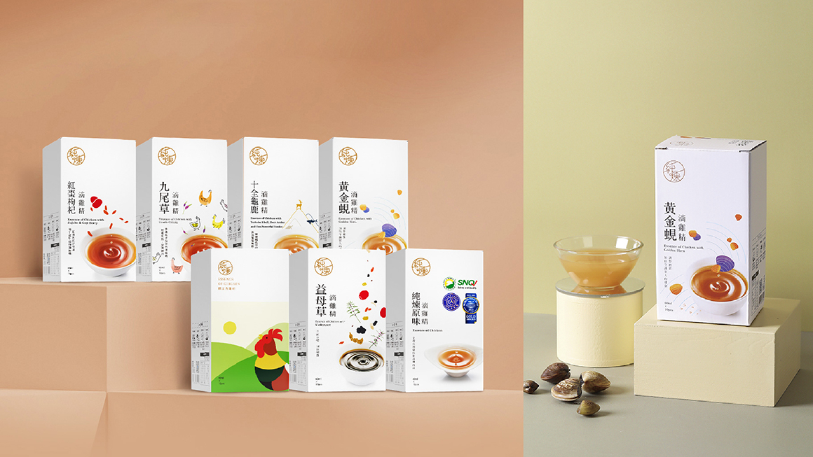
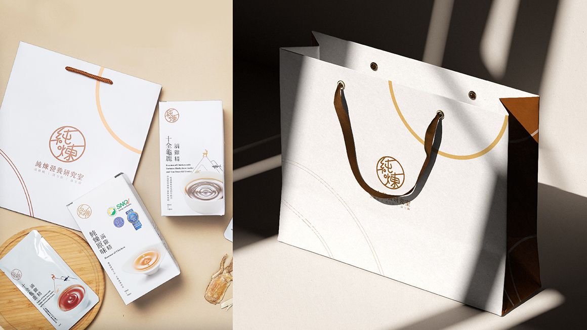
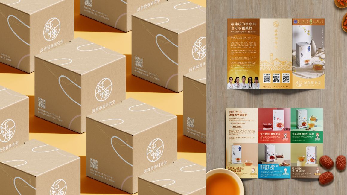
純煉誠食研究室 | 最傳統的滴雞精 也可以更美好
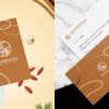
Design Scope
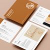
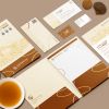
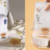
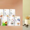
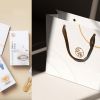
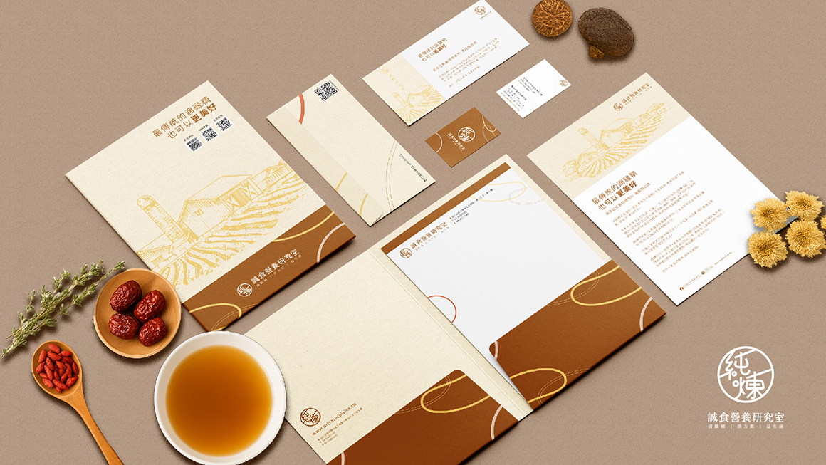
品牌識別設計、包裝設計、品牌應用物設計、商業攝影
Project Overview
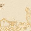
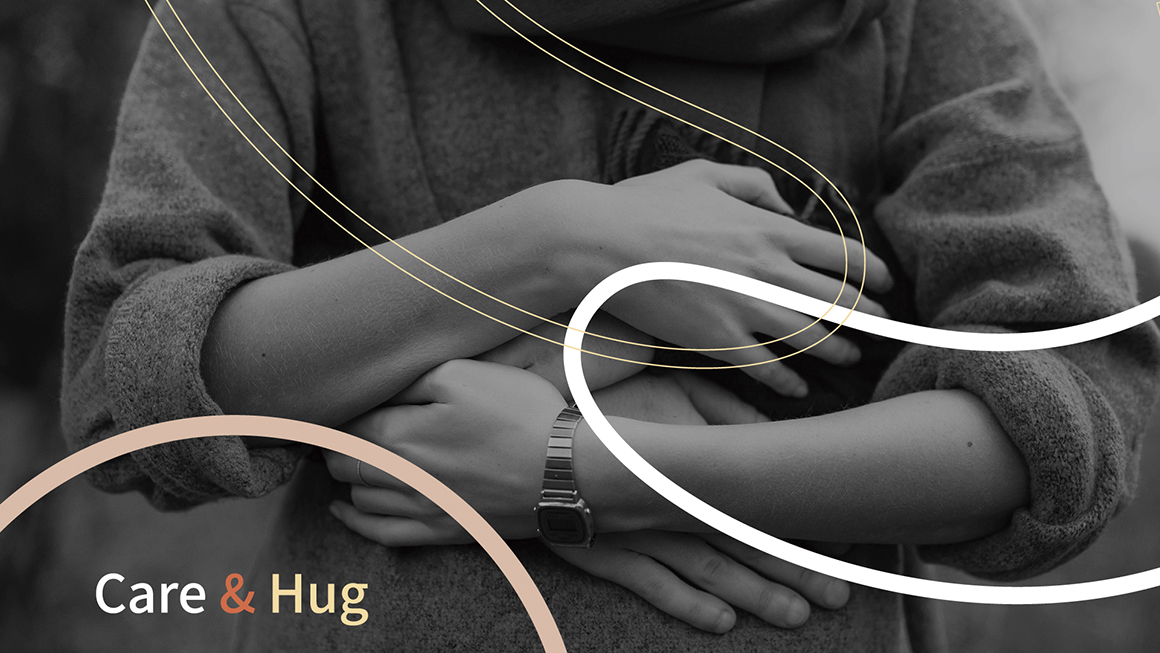
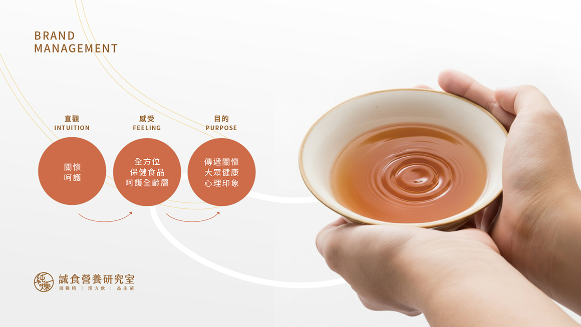
純煉誠食研究室以「關懷與照護」為主,將這樣的意涵融入人們的心理印象,象徵品牌透過全方位的保健食品體驗,保護全齡層,以優質產品及服務精神關注大眾健康。
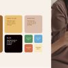
Design Concept
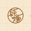
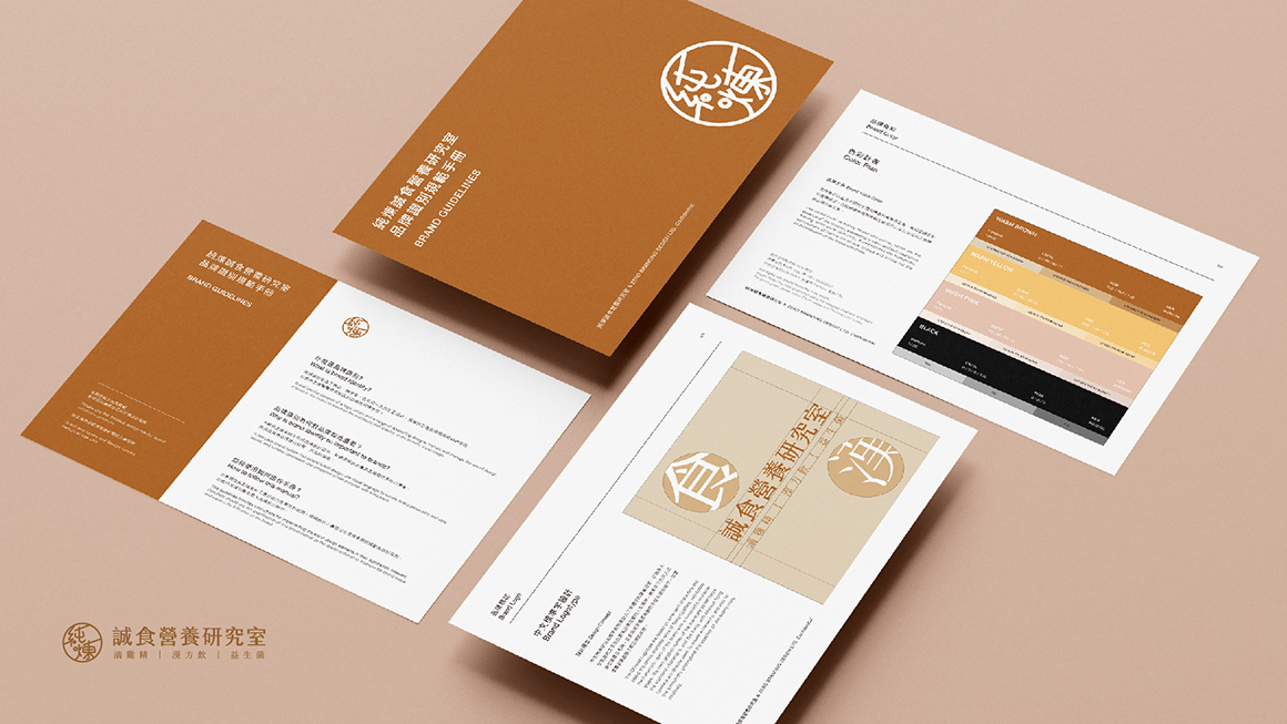
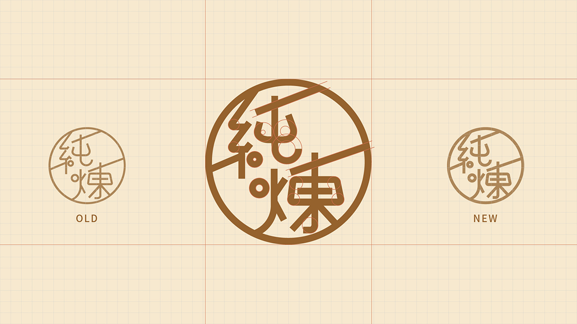
品牌標誌由既有標誌延伸而來,保留已被大眾記憶的經典圓形基礎樣貌,增加線條粗細變化,讓整體圖形在視覺構圖上更有份量,在造型細節上也進行微調,將圓角與傾斜線改以統一、優化視覺舒適度。
-
Project Overview
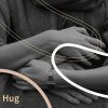
The brand pattern is based on the concept of care and care, which symbolizes that the brand cares for all age groups through a full range of health food, and cares for the health of the public with high-quality products and service spirit. Therefore, the visual image of “hug” is used as the auxiliary graphic of the brand to convey the brand to people’s psychological impression.
Design Concept
The brand logo evolved from the existing logo graphics, retaining the classic circular logo that has been remembered by the public, and thickening the lines to adjust the visual experience, making the logo more weighty when applied to packaging and other carriers, and fine-tuning the modelling details, to unify the rounded corners and oblique lines to optimize visual comfort.
純煉誠食研究室以「關懷與照護」為主,將這樣的意涵融入人們的心理印象,象徵品牌透過全方位的保健食品體驗,保護全齡層,以優質產品及服務精神關注大眾健康。
Design Concept
品牌標誌由既有標誌延伸而來,保留已被大眾記憶的經典圓形基礎樣貌,增加線條粗細變化,讓整體圖形在視覺構圖上更有份量,在造型細節上也進行微調,將圓角與傾斜線改以統一、優化視覺舒適度。
-
Project Overview
The brand pattern is based on the concept of care and care, which symbolizes that the brand cares for all age groups through a full range of health food, and cares for the health of the public with high-quality products and service spirit. Therefore, the visual image of “hug” is used as the auxiliary graphic of the brand to convey the brand to people’s psychological impression.
Design Concept
The brand logo evolved from the existing logo graphics, retaining the classic circular logo that has been remembered by the public, and thickening the lines to adjust the visual experience, making the logo more weighty when applied to packaging and other carriers, and fine-tuning the modelling details, to unify the rounded corners and oblique lines to optimize visual comfort.